Thursday, November 29, 2012

Winter Tales By Vladislav Yerko

The winter is coming, and Christmas is nearby... Even if there is still no snow in the place where you live your mood is slightly turning to the holiday tune. It's the time to put out our favorite tales about the winter and miraculous things happening in this season unjustly considered to be the dullest and less likes by masses.

Hans Christian Andersen's "The Snow Queen" is a really enchanting tale of love, devotedness, adventures and magic. It's one of the longest and most captivating books I read when I was 7 or 8 years old. And I really enjoyed it. I am not going to recite this fairy tale - I'll just say that every children's book should have great illustrations in order to become loved by both young and adult readers. "The Snow Queen" is lucky in this sense because the most prominent artists make illustrations to it.

And one of this fairy tale's editions was illustrated by the wonderful artist Vladislav Yerko who is probably a bit of sorcerer himself. Just have a look at some his illustrations to "The Snow Queen":


Some information about the artist: Vladislav Yerko (born in 1962 in Kiev, Ukraine) is the artist and the author of widely recognized illustrations to books by Paolo Coelho, Carlos Castaneda, Richard Bach as well as to books for children, such as "The Snow Queen" and "The Misty Albion Fairy Tales".

Vladislav is not a public person despite of the fact that his more popular and well-known colleagues call him the best artist and editors are proud of working with him. Books for children, illustrated by this prominent artist regularly get the regional and international awards and the Ukrainian publishing house "Sophia" has recently issued the album of Yerko's illustrations to Paolo Coelho's books which the writer himself considers to be the best ones in the world.


Tuesday, November 27, 2012

Most Shocking Social Advertisement You Have Ever Seen!

As I'm interested in social advertising I always roam on thematic sources in search of some new creations and trends. I've noticed that social ads tend to be more shocking - and this feature is made not without a purpose. If you see the blood, handicapped people who have just lost their hands due to some accident, see some symbols hidden in the intricate graphics of this ad, you will get the idea of the safer behavior quicker than it happens with long texts and slogans preaching of safety, eco-friendliness or social awareness. But some billboards, placards and leaflets look really shocking. You should think twice before showing them to people with fable nerves or to your children. Some of such shocking ads have been forbidden due to cruel images and discreet showing of sufferings. But advertisers insist on the fact that such ads are aimed to teach you a lesson of, for instance, the safer behavior on roads, and they say that if you feel shocked by the graphics and imagery you will quickly memorize the message of this ad.

It's a question of the great controversy, so it's not easy to decide who's right - people who don't like the shocking way to conduct a message or experts who think there is no other way to improve manners and behavior than to startle them.

I have made some short selection of social ads which seem to be quite shocking. Just look at them!

Smoking at the presence of a baby is even worse torture for him.
Are you indifferent?

The desperate outcry "Are you indifferent?" (or Doesn't It Matter?") accompany the whole series of these Russian social advertising billboards. The image of the baby with a cigarette stubbed into its back is really terrible. 


The same "Doesn't it matter?!" ad but here a cigarette is compared with a razor for cutting veins. The message is still very wide-spread: "Smoking is a kind of suicide". 

Mom, why am I an imbecile?
In 8 cases out of 10 the birth of a intelligent-deficient child is the result of alcohol consumption, including low-degree drinks.

The message will become clearer for you if you consider the coloring of the ad. It reminds the color scheme of the infamous cocktail "Jaguar" sold on the territory of Russia, which is very popular among teenagers. 

Rain changes everything. Please, drive to the conditions

When it's raining the bloody streams appear at the boy's face. It's very shocking but nevertheless make drivers slow down. 

The Gas Service 04.
Check the gas! Save your life!

This billboard, placed on the side of the standard multi-storey building has a 3D effect of the same building destroyed by the gas explosion. At the first side, you won't notice that it's just an ad - the effect is very realistic. 

Thousands are held prisoners for their beliefs in places worse than this. 

The social awareness here is a clear image. You walk along the street and see the open hole on the ground. The sight of this man holding a paper with slogan can really startle you but you still can think of many "prisoners of consciousness" kept imprisoned in places worse than the city's drainage system. 

We are tired of warning you.
You have f*cked us out with drunk driving.
The Russian Health Ministry

This message can be interpreted as the last outcry of officials who have to deal with consequences of drunk driving. Bad words are justified in this case, because even shocking images don't have effect on people who like go driving with several shots of vodka in their blood. 

You're probably not expecting a child to run into traffic

The other play with stickers... But as for me, it's not a good idea to place it on the road. If I were driving, I would probably press the brakes and the accident would happen because of this "beneficial" sticker. The one thing seem to be good - it's a whole billboard which tries to make drivers be more attentive and careful. 

Tailgating isn't worth it.

The smacked truck's back and the sedan's front are created by wrinkles on the billboard's surface. I think this ad is good for kinesthetics and it has a realistic full-volume 3D effect of tailgating consequences. 

So, these ads demonstrate a good work of designers, advertisers and copywriters, but some of them seem to be too much even for a great purpose of teaching people how to be more careful. 

Friday, November 23, 2012

Green Social Advertisements - Yellow, Concise And Laconic

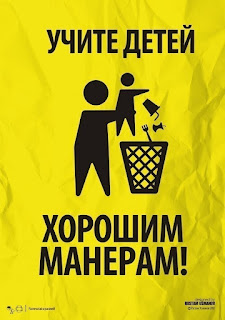
This series of social advertisements promoting the "green" lifestyle and the environmentally aware approach to your life has recently grabbed my attention as something new and persuasive. The yellow and black color scheme, the precise and laconic graphics sometimes reminding the newspapers' and websites' info-graphics and short but impressive slogans make this series a really great social advertising solution. After you've looked at these ads you can feel that you are really eager to protect your environment and to change your lifestyle to the "greener" one. These ads are as following:

The garbage's way to the waste bin goes through our mind!
Be more mindful! 

A small victory for you!
A big victory for the humanity!
Start defeating pollution! 

Your garbage can be the accidental reason of the other people's trouble!
Don't pollute the nature!

The Internet is against pollution!
And you? 

We have had to stop turning our woods into the waste site for a long time!
Don't pollute the nature!

To be a human!
It's not a duty! 
Be humans!

Don't worry!
Our children's children will clean up everything!
It's enough to pollute the world!

Teach good manners to your children!

You have littered your house - don't litter up the others' one!
Don't pollute the nature!

So, these precise, graphical black images on the yellow background are really eye-catching and slogans are well-thought. These ads make us think of the environmental problems and of our children's future. 


Tuesday, November 20, 2012

Perfumes in the USSR - great samples of good packaging

What makes you buy this or that perfume? Not only the smell as it is, but also a package. If you see the seductive, well-designed, interesting and attractive picture you'll probably want to try this perfume on. The package will make your bedroom table or bathroom shelf look great. Some packages are so beautiful that it's a real pity to throw them away after your perfume is run out. As for me, I remember the great perfume "Zen" made by Shiseido, and even greater cubicle form of its flask  I wasn't able to get rid of when no drop of the aromatic liquid remained inside...

Many people today are interested in vintage products, especially perfumes and make-up items. They have become rare, because they are no longer produced. With a perfume, it's sometimes impossible to find "that very" flask our Moms and Grannies used and even if it's stored somewhere in the antique shop or in your attic, the smell is not as it was to be. So, all what you can is only to enjoy the flask's appearance. And the design of perfumes' packages was great. Even in the USSR - this country, as you know, wasn't famous for its cosmetics and perfumes. Soviet women appreciated French and different other "foreign" perfumes. But the design of the Soviet products is stunning - just have a look!

"Rovesnitza"/'The Mate".

This perfume has a laconic, but a little bit art-deco form of the flask. Black-and-gray design of the package, with floral, also art-deco ornament and the romantic portrait of a girl in a medallion-shaped frame makes it a real rarity and a great purchase for all lovers of the antique romance. It's interesting to see the image of a "young beauty' on the package - it's not a sexy blonde chic, but a romantic, mysterious girl wearing the white blouse of the "belle epoch" period. 

"Dymok"/"Smoky"

Many Soviet perfumes came in sets packed in nice boxes with white silky filling inside. So, it made them a great present. "Mist" is a strange name for a perfume (especially when it comes on Russian, I associate the word "Dymok" with cigarette smoke), but the flask's design can be praised. A round shape is very convenient and nice-looking. This prolonged flask is a kind of prototype for pen-shaped perfume flasks which were very popular several years ago (and they still are, because it's very convenient to carry your favorite perfume along in your bag). 

"Chipre" Eau-De-Cologne

A classic Soviet men's perfume especially popular in the 1930s. It had a very "green", "woody" notes in its composition, so it was quite nice-smelling, if one can imagine. But due to mass production, the perfume grew worse and was associated with something cheap and non-pretencious. Here we see two flasks of Chipre. Design of the left one is more practical. It would soon become traditional for all other eau-de-colognes. Protruded "grind" on the flask's surface and the laconic label made in gold-white color combination are quite characteristic. The right flask is somehow more sophisticated and elegant. The form is smooth and the label was made with more designer's effort. Green and gold color combination is the recognizable elements of the Chipre brand. Notice, that the author of this photography appreciated this color scheme and encircled flasks by emerald green beads which color accentuates green coloring of the Chipre label. 

"Karpaty". Eau-de-Cologne

I really like wooden and "natural" motifs in the product and interior design so I really love this package.  It's a great design solution, minimalistic and simple, but also sophisticated and trendy. Just take a wooden texture, greatly designed letters reminding us of the engraving craft, and a stylized geometrical  silhouette of a pine-tree made in the golden color - and you'll get a great package for the perfume of the "natural" series. 


"May Be..." Perfume

This perfume with a "promising" name was actually made in Poland but exported to the USSR. I like this smooth pear-shaped flask with some sexy appeal in it (reminding the female figure), a round golden label and a minimalistic package with the wide contrast square in the middle. I think, the small size expressed some idea of sophistication and prestige. 

"To The Flight" Eau-de-Cologne

I really enjoyed both the flask and the package. These somehow psychedelic white-blue-black-gold circular shapes, crossed by the line of a airplane getting up are fantastic. The streamlined form of the flask is especially convenient and transmits the message of novelty and speed. Lettering is smooth and elegant. The new design expressing the rapidity and freshness is combined with the reminding that the perfume is somehow an elite product (golden ornaments and elegant cursive letters). 

"Real Persian Lilac" Perfume. Nouvelle Etoile, Moscow

It's the essence, a "pure lilac essence" and Nouvelle Etoile (Novaya Zarya) is a perfume and make-up monopolist in the Soviet Russia. Floral aromas were very popular among Soviet women, even the "pure" ones, like this lilac. Package designers made something glamorous, but elegant - this "Barbie" pink combined with golden letters and beige geometrical details is really smart. The form of this flask with "spiral" surface is great too. 

"Charming Naughty Girl"

Designers worked hard in order to express the image of a young coquette with all these ribbons, yellow-black dotted ornament and smooth flask. And they managed to do it! Lettering is also very interesting - some earliest prototype of Comic Sans MS. As you see, almost all Soviet perfumes have gilded elements on their packages. It's not an exception. This outstanding yellow color scheme combined with strikingly black dots and with this ribbon make it really attractive. 

"Bars" Eau-de-Cologne

The real perfume for real man - this can be said of it. Laconic details, black and white color scheme and masculine name are great for expressing the idea of manliness. 

So, as we see, packages and flasks are great but we can only guess what kind of perfumes they contained. And that's pity! But what to do - any smell is quite short-living. What remains from it is designer's ideas expressed in the perfumes' packages. 


Friday, November 16, 2012

Really Strange Social Advertising

I've recently discovered some strange samples of the Russian social advertising. They are about disabled people and that we shouldn't pay attention on their disabilities. Generally, the message is like "OK, we are all different and that's great". Advertisers chose to emphasize this difference via comparing disabled people with some controversial artworks, like Malevich's "Black Square" etc. "Yes, you may not like it but it's still the art".  I think it's not very politically correct, at least. May be, a disabled person may be offended by such a comparison. Advertisers have stepped on the slippery ground, anyway. Let's have a look at what they've done.

Picture - Art
Look at deviations from the norm in the another way. 
Every disabled person can be great. 

 Fruit - Brand
(the text is the same as it is on the previous picture)

Tower - Legend 


The design is quite minimalistic and primitive drawings are in fashion now, but anyway, I think it's a rather bad sample of a social advertising campaign. Yes, "Black Square" is a great masterpiece, Apple Inc. is a great company which has changed our idea of electronic devices and Pisa Tower is the great landmark of this Italian town, but the idea of deficiency compared with "the norm" (a lifelike, realistic picture; a "whole" apple; a straight-standing tower) lies behind this "appreciation of greatness".  "Deviations from the norm" is a bad idea for a slogan, anyway. Who is defining this norm? Especially if we are speaking about people? I believe that many handicapped people really suffer from being "special" and from the constant emphasis on the idea that "they are not like normal people". This advertising campaign may only make things worse. 

But, may be, I'm not right and this idea for ads is really great. What do you think about it, by the way?